New publication: A practical guide for creating circular migration plots
In this hands-on contribution, we give you the tools, code and tips to create your own circular migration plots
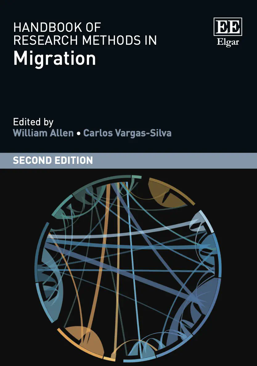
 Cover image (by Genoni and Sander)
Are you starting a project on the migration of people? Do you need some practical advice and guidance about how to visualise these people’s movement? If so, this hands-on article might come in handy for you.
Why the article could be valuable for you
Visualising migration flows can be a messy endeavour. Using world maps as a basis has proven impractical due to the different sizes of countries or regions and migration flows that go in and out from designated areas. Dataviz techniques such as flow charts perform a bit better with respect to variation in size of regions and flows, but struggle as soon as there are too many regions that you want to visualise.
With circular migration plots (simplified version in the image above), you are able to visualise migration inflows and outflows between numerous regions at the same time without overburdening your readers. In the article, we give you practical advice on how to create your own plots and provide free access to the necessary R code (see also below). We discuss the pros and cons of visualising migration flows using circular migration plots, and talk about colour choice, accessibility and other design elements creators have to decide upon, giving examples of better and less good implementations of such decisions.
Get the article and code for free
You find the article online at Edward Elgar Publishing. Just get in touch with me if you lack access. The code and data to reproduce the plots we created in the article are available for free on my Github repository.
Credits
This contribution is joint-work with my dear and former colleague Nikola Sander. She was instrumental in establishing the circular plot in migration research. Here you can check out her seminal paper about “quantifying global international migration flows”, which was published in Science.
Interactive visualisation of migration flows
We also created an interactive tool with which you can browse through the past 30 years of global international migration and refugee flows, and internal migration flows in Germany. The tool is very useful to learn about the history and changes of the movement of people worldwide. You can download all the materials, including static visualizations of the tool, a poster of the project, and code to reproduce the tool and the static plots here. This project was realised together with Tamilwai Kolowa (BiB), Tina Frank, Clemens Schrammel (both University of Arts Linz), and Ramon Bauer (Statistics Vienna).